Did you know that almost 70% of all global web traffic comes from mobile devices (SimilarWeb)? In the US, that number falls to around 55% – still reflecting an immensely important fact: if your WordPress site isn’t optimized for mobile users, you could be missing out on significant traffic and potential customers.
Mobile responsiveness means that a website can automatically change to fit the screen size of any device you use, like a computer, tablet, or smartphone. This makes sure the website looks good and is easy to use no matter what kind of device you’re on.
Mobile responsiveness isn’t just about making your site look good; it’s about making sure people can easily use it on any device, like phones, tablets, or computers. Luckily, improving how your site works on mobile devices doesn’t have to be hard. Here are some simple fixes to help your WordPress site look and work great on mobile.
1. Choose a Responsive WordPress Theme
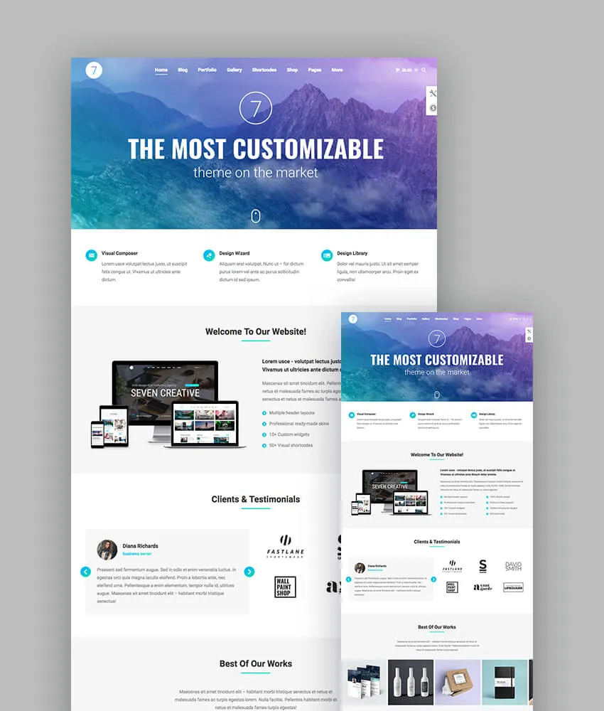
Why It’s Important: A responsive theme automatically adjusts your site’s layout based on the user’s device screen size, ensuring optimal viewing on desktops, tablets, and smartphones.
Quick Fix:
- Switch to a Responsive Theme: If your current theme isn’t responsive, consider switching to one that is. Popular responsive themes include Bricks Builder, Astra, OceanWP, and GeneratePress.
- Preview Before Activating: Use the theme preview feature to see how the new theme looks on mobile devices before making it live.
How to Do It:
- Go to your WordPress dashboard.
- Navigate to Appearance > Themes.
- Click Add New and search for a responsive theme.
- Preview and install the theme of your choice.
2. Use a Mobile-Friendly Plugin

Why It’s Important: Plugins can add mobile-friendly features to your site without requiring extensive coding knowledge.
Quick Fix:
- Install a Mobile Optimization Plugin: Plugins like WPtouch or Jetpack can create a simple, mobile-friendly version of your site.
How to Do It:
- From your dashboard, go to Plugins > Add New.
- Search for WPtouch or Jetpack.
- Install and activate the plugin.
- Configure the settings to suit your preferences.
3. Optimize Images for Faster Load Times
Why It’s Important: Large images can slow down your site, leading to a poor user experience and higher bounce rates.
Quick Fix:
- Compress Images: Use image optimization plugins like EWWW Image Optimizer, Smush or ShortPixel to reduce image file sizes without compromising quality.
- Use Correct Image Formats: Implement modern image formats like WebP for better compression.
How to Do It:
- Install an image optimization plugin.
- Bulk optimize existing images via the plugin settings.
- Enable automatic optimization for future uploads.
4. Implement a Responsive Navigation Menu

Why It’s Important: A cumbersome menu can frustrate mobile users. A responsive menu improves navigation and user experience.
Quick Fix:
- Use Your Theme’s Built-In Responsive Menu: Nearly every modern WordPress theme comes with a responsive nav menu.
- Use a Mobile Menu Plugin: Plugins like Responsive Menu or Max Mega Menu can help create mobile-friendly navigation.
- Simplify Menu Items: Reduce the number of menu items for a cleaner look on smaller screens.
How to Do It:
- Install a responsive menu plugin.
- Customize your menu layout and style via the plugin settings.
- Test the menu on a mobile device to ensure functionality.
5. Enable Accelerated Mobile Pages (AMP)
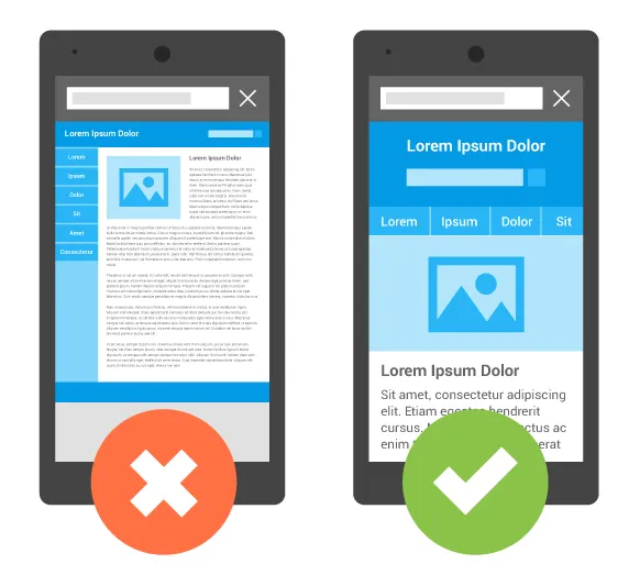
Why It’s Important: AMP provides a stripped-down version of your site that loads quickly on mobile devices, improving user experience and SEO.
Quick Fix:
- Install an AMP Plugin: Use plugins like the official AMP for WordPress to enable AMP pages on your site.
How to Do It:
- Go to Plugins > Add New.
- Search for AMP for WordPress.
- Install, activate, and configure the plugin.
6. Eliminate Pop-ups and Intrusive Interstitials
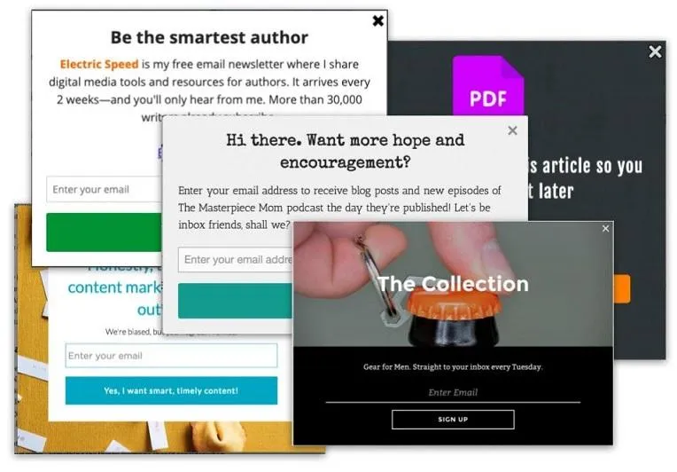
Why It’s Important: Pop-ups can be particularly annoying on mobile devices and may lead to penalties from search engines.
Quick Fix:
- Disable Pop-ups on Mobile: Use your pop-up plugin settings to disable them for mobile users.
- Use Less Intrusive Alternatives: Consider using banners or inline calls-to-action instead.
How to Do It:
- Access your pop-up plugin settings.
- Navigate to display rules or targeting options.
- Exclude mobile devices from pop-up triggers.
7. Test and Optimize with Google’s PageSpeed Insights
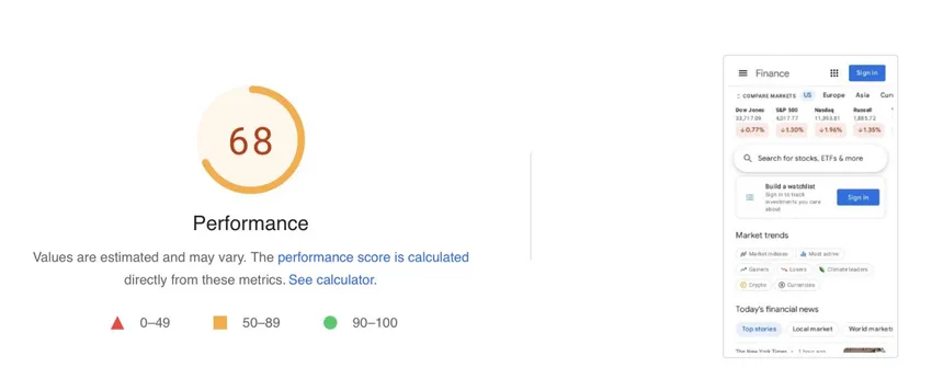
Why It’s Important: Google’s tool provides insights into issues affecting your site’s mobile performance.
Quick Fix:
- Run the Test: Visit Google’s Pagespeed Insights and enter your site URL, or check out GTMetrix.
- Implement Recommendations: Fix any issues identified by the test.
How to Do It:
- Go to the testing tool.
- Enter your website’s URL and run the test.
- Review the results and follow Google’s recommendations.
8. Optimize Typography and Button Sizes
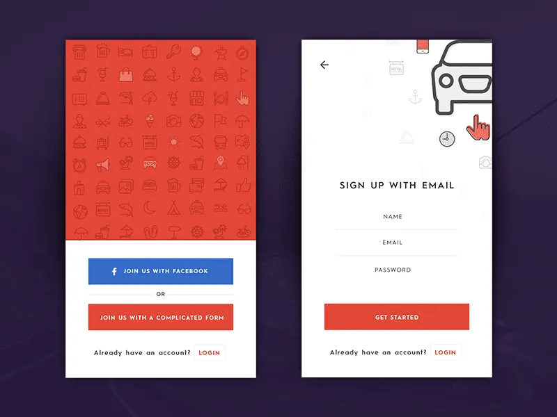
Why It’s Important: Readability and clickable elements are crucial for mobile users.
Quick Fix:
- Adjust Font Sizes: Ensure text is legible without zooming.
- Increase Button Sizes: Make buttons large enough to tap easily with a finger.
How to Do It:
- Use the theme customizer or CSS to adjust font sizes.
- Edit button styles to increase padding and size.
- Test changes on a mobile device.
9. Leverage Viewport Meta Tag
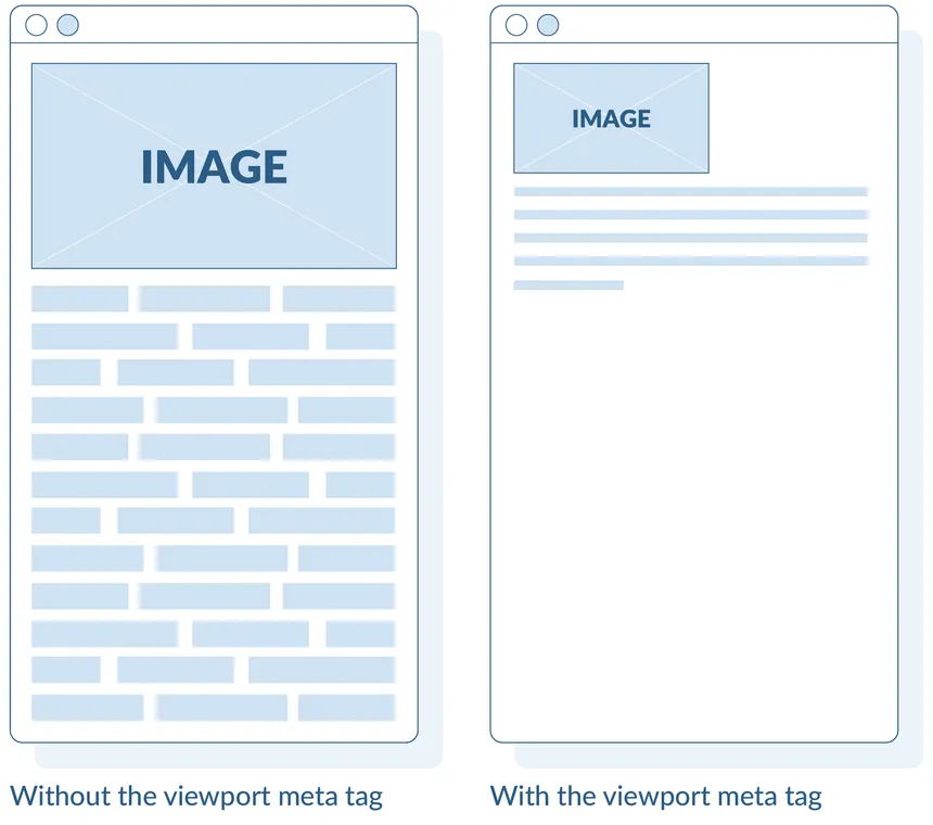
Why It’s Important: The viewport meta tag tells browsers how to adjust the page’s dimensions on different devices.
Quick Fix:
- Ensure Viewport Tag is Present: Most themes include this by default, but it’s crucial to verify.
How to Do It:
- Check your site’s HTML header for
<meta name="viewport" content="width=device-width, initial-scale=1">. - If missing, add it via your theme’s header.php file or using a plugin that allows header edits.
Conclusion
Improving your WordPress site’s mobile responsiveness doesn’t have to be overwhelming. By implementing these quick fixes, you’ll enhance user experience, reduce bounce rates, and potentially improve your search engine rankings. Mobile optimization is an ongoing process, so regularly test your site on various devices to ensure consistent performance.
Additional Tips:
- Regularly Update Your Theme and Plugins: Updates often include improvements for mobile responsiveness.
- Use Mobile Preview Tools: Utilize tools like BrowserStack or Responsinator to see how your site appears on different devices.
- Monitor Site Performance: Keep an eye on your site’s analytics to identify and address mobile user drop-offs.

